One of the hardest parts about working with a web designer is figuring out how to give them direction. Designers tend to have their own unique styles, so step one is to choose a designer whose portfolio you like. But after that, how do you convey what you want your site to look like? What if you don’t know what you want it to look like?
Tip 1: Find inspiration.
It’s always easiest to start with some inspiration. Starting from scratch can leave you (and the designer) in that uncomfortable blinking-cursor situation. The options for design are endless, so starting from scratch leaves too many possibilities and choices. But where can you find inspiration?
- Actual websites you love are best. If you know you’ll be redesigning your website in the next year or two, start keeping an eye out for websites you love. They don’t have to be in the same industry as you, just look for designs you love that really speak to you and feel easy to use. Here are a couple websites I’m loving lately: Origin Outside, Laura Lee Life, Mountain Hive, Takesada Matsutani, & Owltastic. Keep a list of these wherever it’s easy for you — your Notes app, a Google doc, an email draft, etc.
- Check out templates. If you’re short on time and need to find some quick design inspiration, check out Squarespace’s templates, Wix’s templates, or Webflow’s templates. These can be good starting points, and if you send a few to your designer, they can start to gather your design style (they’ll see if you like a lot of white space, a lot of color, full-bleed images, etc.)
- Search for websites on Pinterest. Pinterest websites tend to follow that Instagram-pretty kind of style, so you might not find a ton of variety, but it can be a good place to start figuring out what feels good and what doesn’t.
Tip 2: Answer some key design questions.
To get your site going in the right direction, you’ll need to make some decisions on some key components of your site’s design.
Full Bleed Hero Image or Inset Image?
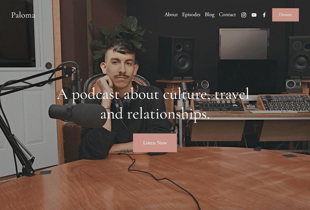
A full bleed or full width hero image means it fills the entire website window.
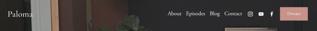
The Squarespace Paloma theme uses a full bleed hero image:
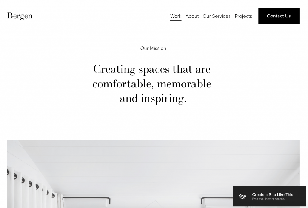
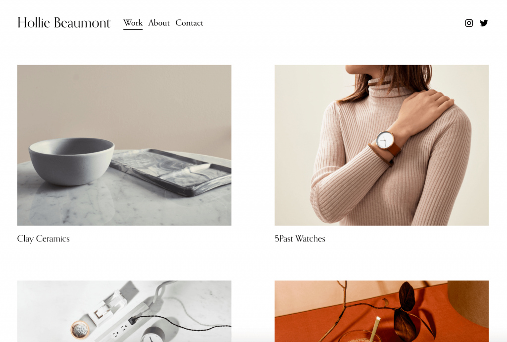
The Squarespace Bergen and Beaumont themes feature an inset hero image/images:
Sticky Header or Not?
A sticky header sticks to the top of the website window as your website visitor scrolls down, so it’s always visible and easy for them to click. A non-sticky header disappears as the website visitor scrolls down.
It might sound like a sticky header is best, but I tend to prefer non-sticky headers for most of my client sites. If you just like the look/feel of a sticky header, if your site has really long pages (lots of scrolling), or if your site is e-commerce focused, a sticky header might make sense for you. For most of my websites, I try to keep page length short and include site navigation in the footer.
Check out Squarespace’s Bergen template to see a sticky header in action (scroll down and you’ll see the header stays visible). Compare this to Squarespace’s Maru template where the header navigation disappears as you scroll down.
Header Menu Order
Your header/top navigation will likely include your logo, your site menu, and a call-to-action (usually designed as a button to draw attention to it). All website builders have some flexibility in this order, so it’s often up to you to decide what you like best. Here are the most common formats:
1. Logo left-aligned, Menu & CTA Button right-aligned
2. Logo & Menu left-aligned, Social Media Buttons right-aligned (button could be right aligned too)

3. Menu left-aligned, Logo center-aligned, CTA Button right-aligned

4. Logo left-aligned, Menu center-aligned, Social Media Buttons right-aligned (button/card could be here too)

Merge Header with Content or Not?
The top header menu can either rest on top of a color (white, black, something else, etc.) or over your hero image — if it’s over your hero image, we call this a merged header. This is entirely up to your personal preference.
Parallax Scroll or Not?
Parallax scroll is a website animation where the background content (usually an image or graphic) moves at a different speed as the main content (usually text) as you scroll. Some people love parallax, some people hate it. For the most part, parallax scrolling doesn’t carry over to mobile, so this will likely just be visible on desktop devices.
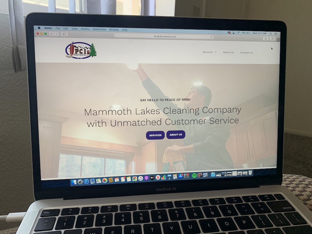
Here are two client sites using parallax scroll for the top header image: Perfect Clean Inc. and The SMC Dietitian.
And here are two client sites not using parallax scroll: Ground Up Climbing Guides and Skin Up Ski Tours.
Stock Photos or Your Own Photos?
If at all possible, using professional photos of you/your business is your best bet. But stock photos can be better than blurry/pixelated or amateur/iPhone photos of you and your business. It’s absolutely worth hiring a photographer if you have the budget for it. While you’re saving up or when you’re just getting started, I recommend these free stock photo sites.
Tip 3: Spend some time exploring fonts and colors.
I’m working on another blog post with tips on finding fonts and colors and an explanation of why these two things matter so much, but here are a few things to think through in the meantime.
- If you have a logo, check with your logo designer to get the colors and fonts used in the logo. Ask if they have suggestions for complementary fonts or colors. Most designers will scope out working with you to determine branding/style guidelines that can be used on your website. Let them know you’re looking for fonts and colors for website use specifically.
- Decide if you’re more drawn to serif fonts, sans serif fonts, or script/handwriting fonts. Explore all of Google’s fonts. When possible, I like using Google Fonts for website projects (or Adobe Fonts for Squarespace) since they’re often built-in and free, load quickly, and display well for most users.
- Read a few articles on fonts: this one from Wix or this one from Website Builder Expert.
- Read a few articles on colors: this one from Elementor or this one from Website Builder Expert. I also recommend creating a mood board on Canva or a similar tool for inspiration. Mood boards are super helpful to share with your website designer before or during your work together.
The more tangible inspiration and direction you can share, the easier it will be to end up with a website you love.
You don’t have to do all of these things before you reach out to a website designer (and many website designers are also graphic/brand designers who can also help you through each of these stages), but any insight you can share into your design vision/dreams will help your designer efficiently and easily build your dream website.
And while it might feel like a lot of work, when you start to pay attention when you’re browsing the web in your daily life, you might find that it’s a fun exploration process, kind of like trying new foods or new hobbies. You’ll get a feel for your personal design style even if you don’t carve out time for it specifically.