
Like many small businesses do, we put off redesigning the Mammoth Lakes Chamber of Commerce website for months. We knew it would be a serious undertaking (of both time and money) and we wanted to make sure it was done right. With a staff of just two people, other projects had to be put on hold while we worked on it.
Ditching the Old Site
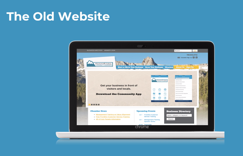
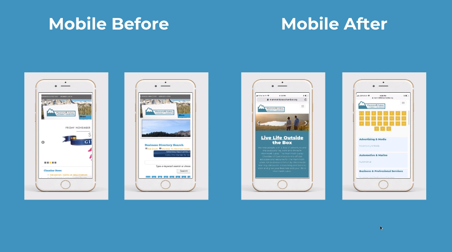
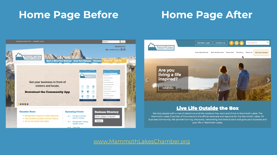
Our previous website wasn’t mobile-friendly. The search feature only searched half the site. And worse than both of those, it didn’t convey that the Chamber was the authority on business information in the Town of Mammoth Lakes. From our home page, it wasn’t clear to anyone where to click next. Come to the 4th of July parade, our home page said. We missed the mark… big time.
The old website was built before mobile-responsiveness was a must. It was patched together (WordPress & our CRM, ChamberMaster) and there was no way to integrate it well. We knew that our website was the front door to our organization. If I was a prospective member and landed on our old website’s home page, I definitely wouldn’t reach out for more information. We were losing out on new members.
So we made time and allocated budget for a full website redesign.
Step 1: Conducting an Audit
Our website became a dumping ground for whatever we wanted to let our members know about. Information about starting or growing a business was buried in various pages under various menu items. And with a search feature that didn’t work, we really weren’t serving anyone. More and more traffic was coming from mobile devices, and we had no way to serve those people either.
Before anything else, we listened.

Our website redesign happened to align with our first Business Retention & Expansion Survey, a long form survey of both members and non-members. We also had data from our last two year-end member surveys. We spent two months working on our own and with our Board of Directors to determine who our ideal audience was, what impression we wanted to give our website visitors, and what our must-haves were for our new website. We collected all of the data to come up with a strong brand voice.
Then we took a close look at our current website.
We made a site map of our entire website and decided what content we wanted to bring over to the new site. We wanted to develop the new site without hanging on to content on our old site, but we also wanted to avoid reinventing the wheel. So we moved any relevant content to Google Docs so we could access it later if needed.
Step 2: Wireframing the Website
Once we had defined our brand voice, we came up with our target markets so we could target the website directly to them.
We walked through our ideal clients’ problems and how we could solve them.
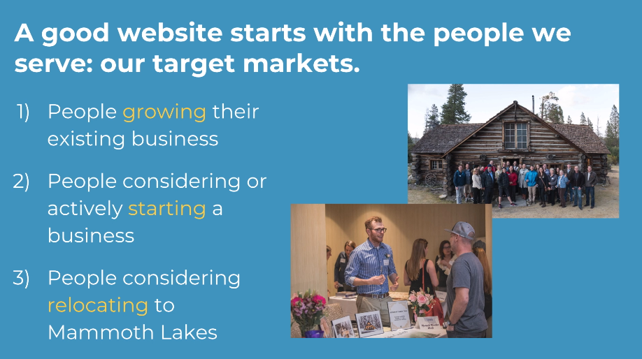
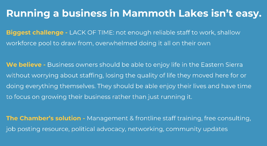
We came up with three target markets and worked with our Board of Directors (all local business owners) to outline the biggest challenges each group faced, the beliefs we had about their struggles, and what solution the Chamber offered to them. Throughout this whole process, we weren’t sure what platform we’d build the website on.
Then we drafted our dream wireframe.
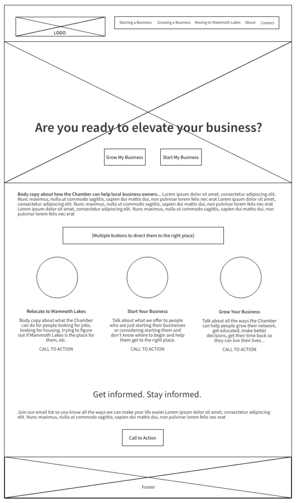
Before jumping into looking for a theme or figuring out what platform we’d build the website on, we created our dream wireframe — a fancy word for a sketch of what you picture your website looking like. The goal was to move our three different target website visitors through the site easily. Since we were talking to people starting businesses, growing businesses, and moving to Mammoth Lakes, we didn’t want to waste anyone’s time getting to the information they needed.
In our wireframe, we knew we wanted multiple places on the home page to direct website visitors to the content that was most relevant to them. We also wanted to highlight the transformation they’d have if they got involved with the Chamber, so we knew we’d use imagery showing happy local business owners doing what they moved to Mammoth Lakes to do — hike, ski, mountain bike, etc.
Step 3: Choosing the Content Management System (CMS)
Once we had a vision and a basic sketch, we had to choose a platform. ChamberMaster offered reasonably-priced website templates that wouldn’t require our staff to learn a new system. We interviewed several other CRMs that provided websites, but none offered a product that was compelling enough for us to switch CRMs. And since the website had to integrate with ChamberMaster, a WordPress build wasn’t an option.
Keep it simple, stupid.
A small business’s website MUST be simple to manage. Most people I work with don’t have time to learn a new system or work out unfamiliar kinks in a website. And they don’t have the funds to hire a full-time website manager. In looking at ChamberMaster’s themes, we found one that felt similar enough to our wireframe that we could work with it.

We had to adjust our vision so it would fit in the template, but we felt with great content and messaging that the Captivate theme ChamberMaster offered would serve our website visitors well. We spent several days writing and revising draft content for the main pages.
Step 4: Drafting Content & Bringing it to Life
We had worked through an audit of our old website, developed our brand voice and brand proposition, figured out our ideal client and how to cater to them, drawn up a wireframe and chosen a platform.
Working with a done-for-you CMS made bringing the website to life much easier for us. We turned over our fonts (Google Fonts for the win!), our branded colors, and our draft copy for the home page, and they started building the site.
A week or two later, we received an initial draft of the site, fine tuned the content, built out the interior page content, and added strong imagery throughout the site. Once everything was ready to go, ChamberMaster made it live. Less than 24 hours later, our old website was never to be seen again.
Step 5: Determining Next Steps
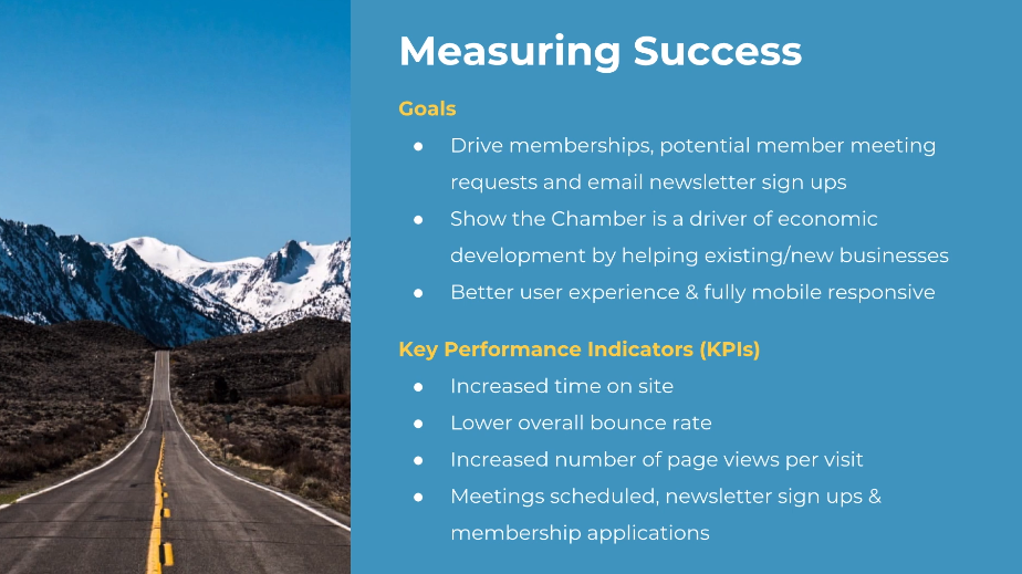
If you’re going to spend the time and money on a website re-design, having goals is a great way to ensure you’re hitting the mark. The goal of a re-design is to better serve your current and potential customers, and having ways to measure this will keep you on track once the site is live. Knowing your key performance indicators from the beginning of the process will keep you thinking about your website visitors’ experience.
Once the site was live, we focused on getting our board members up to speed on the site. The Chamber’s board members are the organization’s most important ambassadors, and their feedback throughout the process was key.
Because we built a site focused on a seamless user experience, we wanted to make sure we were delivering on that. We made a plan to assess Google Analytics on a bi-monthly basis (comparing to data from before the re-design) and make sure users were finding what they needed. Check out the new site.
Is it worth it?
Absolutely. Your website is often the first impression someone has of you or your business. If you miss that chance to convince them that you’re the one, you might miss them entirely.
Unless you’re particularly passionate about websites, a re-design isn’t something I recommend small business owners handle on their own. I offer WordPress and Squarespace website design for small and medium size businesses. Learn more or contact me if you’d like to talk.