
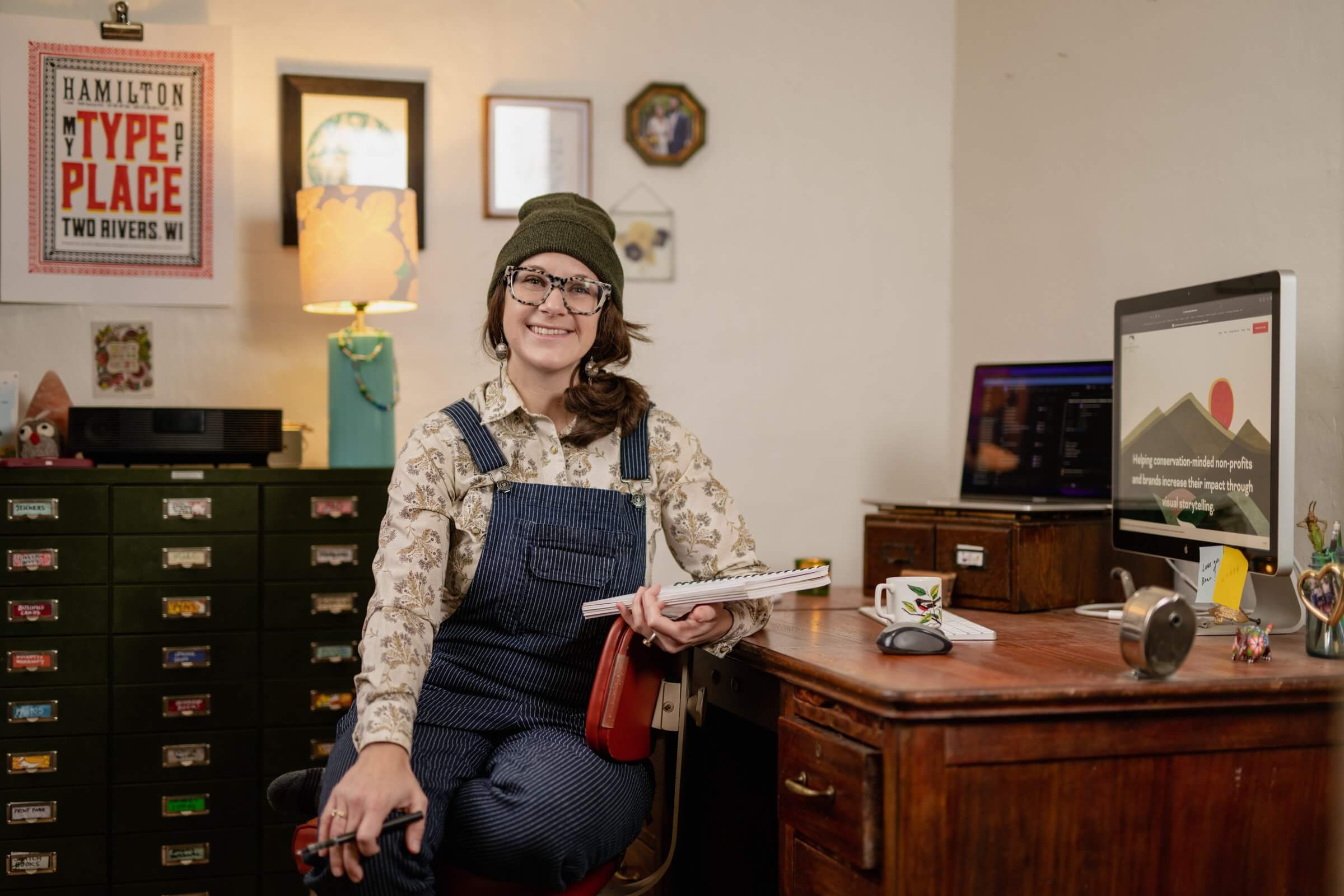
A few months ago graphic designer Margo Stoney posted on LinkedIn about a change she made to her logo design process based on accessibility. She started including a color accessibility page in her brand style guide deliverables. Margo runs High Mountain Creative, a graphic design studio dedicated to saving the planet.
As Margo wrote, “Since learning about color contrast ratios and accessible colors, my logo process includes the important step of checking that a color palette isn’t only aesthetically pleasing but that it’s highly functional, too.”
I love that Margo includes this when she works with clients. I wish all graphic designers considered accessibility — it makes a world of difference in the website build process to have a color palette that already meets accessibility requirements. When this isn’t done, we have to tweak the colors or how they’re used to make sure website text is easily readable.
I got in touch with Margo to chat more about this and her accessibility journey as a graphic designer.
How Margo Got Started with Accessibility
A few years ago Margo took on a project for a government agency that included creating PDFs that were Section 508 compliant. She learned as she went and got connected with an accessibility pro, Dax Castro at Chax Training and Consulting/Accessibility Unraveled, to help her with things that went beyond her scope of knowledge.
“It was a huge eye opener that there was a lot I didn’t know and a lot I needed to learn,” Margo says. Many of us learn about accessibility this way.
Margo did several smaller accessibility projects after her first large project, and she suggests gaining confidence and learning the ropes on smaller projects when possible.
Margo now has her own internal SOPs for accessibility, especially for InDesign documents. She has checklists and directions for handling hyperlinks, setting up paragraph tags and headers, export options, etc.
“Nowadays every designer needs to have a basic knowledge [of accessibility] even if they don’t know how to do it themselves or what the rules are,” Margo says. “If a client comes to me and says ‘I need this to be accessible or read by a screen reader,’ at least know what that means. If you don’t know how to do it, hire someone who does or get help.”
Margo encourages all designers to know the basics so they can help clients and make their work more accessible. “Don’t ignore it,” she says.
How Accessibility Plays Into Margo’s Work
Accessible PDFs
As Margo learned about accessibility, she had to completely rework her process. She initially learned to work in InDesign with a focus on the final product or printed version; it didn’t really matter what the back end looked like. Accessibility guidelines require a lot of work in the back end with tags, thoughtful text flows, images, etc.
“From the first click, [an accessible document] has to be built every step of the way to be accessible,” Margo says. For logos, she doesn’t start the design process until the colors have passed contrast checks. It’s easier to bake this into your process than go back and re-work something after the fact.
The added requirements to make a document accessible can feel limiting. I hear this often in the web design community as well. There are extra steps involved to make a project fully accessible, and this translates to a higher price tag for a client. There are also extra things the client needs to provide, Margo says, like alt text for the images in a document so a screen reader can convey the meaning of that image.
Creating accessible files in InDesign requires a different process and can take some time to relearn for someone who was classically trained in print design. Some of the processes can feel limiting to the creative process, especially for someone who isn’t an accessibility expert. Margo has spent a lot of time thinking about this in her years running her graphic design studio.
“Design, in the big picture of things, is to visually communicate something, solve a problem, serve a purpose… it’s not art. That’s a different thing.”
Margo says, “I’ve always married the two in my work. In having to create things that are accessible, I’ve had to figure out how to do that while honoring both of those pieces.”
Color Contrast & Accessibility
Clients sometimes come to Margo with an established brand or having just been through a re-brand, and sometimes she has to let them know their colors can’t be used for text or backgrounds because they don’t have adequate contrast.
Some people just don’t know what they don’t know, Margo says. It’s disappointing to invest in creating a brand you love for your business and then find that your colors aren’t widely usable because they aren’t accessible. Some businesses are less willing to move away from their brand colors to meet accessibility standards, and it may take some client education to help move the needle on why it’s important in making a brand more inclusive.
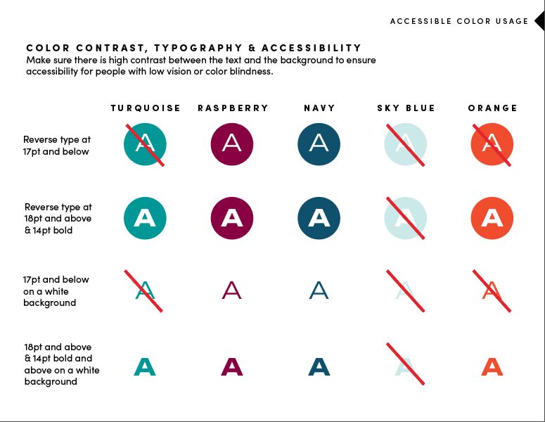
Making changes to hues and adjusting an existing color palette can be pretty simple, or you can rely on the higher-contrast (more accessible) color combinations in your palette and leave the colors with less contrast for accents. Or the design might just need a thicker or larger font to be used. Margo recently published a blog post on how to make your brand’s color palette accessible.
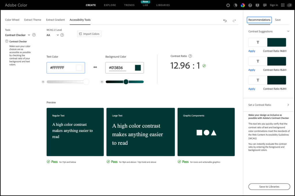
Another note Margo brought up: we can’t always trust our eyes to check color. We both like to use color contrast checkers to be sure. Sometimes a color looks like it has enough contrast from the text or background, but it doesn’t pass checks. To check this, you can use the Adobe Color Contrast Checker or Erik Kennedy’s Accessible Color Generator. You can check your website pages’ existing color contrast with the WAVE tool.
As of this year, Margo’s brand style guides all include her color accessibility page so clients can make smart decisions around using their brand colors. “I have yet to see another agency’s brand guidelines that has that,” Margo says, but we both hope to see more of this in the future.
Why Design with Accessibility in Mind?
Accessibility may be a requirement from clients. They may have specific accessibility laws or guidelines they have to follow, or they may just want their materials to be accessible because it’s the right thing to do. So not knowing about accessibility means a designer may miss out on that project.
Just as it’s the right thing to do for businesses and nonprofits, Margo and I both believe it’s the right thing to do as a graphic designer or web designer. The more you learn about it, the more you want to create things that everyone can access and enjoy. And for things like color contrast, it’s not just people with diagnosed disabilities who miss out on what you create — this can affect people as they age or people with temporary or minor vision issues.
“From an ethical and moral standpoint, I wonder how many years I’ve designed something that people couldn’t read,” Margo says. “How many times has [a screen reader user] digested something I’ve created and thought ‘this is useless for me?’”
Talking to Clients About Accessibility
“People are realizing they need to start asking for [accessibility] or incorporating it, but they don’t know where to start,” Margo says. This leaves people like Margo and I in charge of educating people, which can be a tricky thing. I recommend asking any graphic designer or web designer you’re considering working with how familiar they are with accessibility and being clear about your accessibility needs or requirements.
Margo does a lot of client education around color contrast. Before taking on a project, she talks to clients about accessible PDFs if they ask for it or have legal requirements for it. Creating accessible PDFs can often be a much bigger project. Currently it seems to be more of a requirement for large organizations or government agencies with more stringent accessibility requirements, but it wouldn’t be surprising if it soon became the industry standard.
The Future of Graphic Design and Accessibility
Accessibility has come to the forefront of design in recent years. I believe it’s only growing. Margo is hopeful that it will continue to get easier to incorporate as the design field evolves.
“I didn’t learn about [accessibility] in school,” Margo says. “Hopefully people who are learning [graphic design] now, it’s part of the curriculum.” She’s hopeful today’s students will just have accessibility built into their graphic design processes from the beginning rather than having to change their processes later to add it in.
If you’re looking for a sustainability-focused graphic designer, High Mountain Creative is a great partner. Margo is one of my favorite people to follow on LinkedIn, and she sends a lovely quarterly email newsletter as well.