

If you’re a website owner, you might have heard about website accessibility. The topic of website accessibility can cause a lot of confusion and frustration (even among web designers) because the legal requirements are evolving, and some accessibility updates are pretty technical to implement.
But it’s an important topic for website owners to pay attention to. Taking steps to make your website more accessible will open doors for people with a variety of disabilities and challenges to access your content and services.
Many things that make your website more accessible to users with disabilities will actually improve the user experience for all of your website visitors, and some even help with SEO.
From a bottom line perspective, you could be missing out on potential customers, clients or supporters who can’t access you because your website isn’t accessible. There’s legal risk too — there have been thousands of lawsuits filed regarding website accessibility. Per the American Bar Association, in 2020, over 85% of digital accessibility lawsuits filed federally occurred in New York, Florida, and California.
Note: this post is NOT legal advice. If you’re concerned about website accessibility, always consult your lawyer. This is also an incomplete list. Website accessibility is complex and ever-changing, and this blog post just barely scratches the surface. Still, these tips will take you a few steps in the right direction.
The best way to make sure your website is accessible is to work with an website design/development agency that specializes in accessibility. Equalize Digital is one I’ve had personal interaction with.
Many website designers and developers have familiarity with accessibility and build with best practices in mind (like me!), but most won’t and can’t guarantee accessibility because of its complexity and changing nature. If working with an accessibility-focused agency isn’t feasible for you right now, consider taking these first steps for a more accessible website.
Create an accessibility statement & respond to any issues/inquiries.
An accessibility statement should share what you’re doing in terms of accessibility, whether your work is ongoing, and who someone should contact if they have issues using your website. If there’s a specific person to contact at your company, you should make this clear.
If you have a WordPress website, I recommend the free Accessibility Checker plugin from Equalize Digital. This plugin automatically creates a draft page of an accessibility statement.
If you’re not using WordPress, I recommend this accessibility statement generator from the Web Accessibility Initiative. Here’s a statement I created with this generator.
Your accessibility statement should be linked in the footer of your website so it’s easy for folks to find.
Also critical — make sure you’re keeping an eye out for any accessibility issues or inquiries that come in, and respond to them quickly. You can add an estimated time frame for a response to your accessibility statement. Be ready to help anyone who needs help using your website.
Make sure the colors you’re using have adequate contrast.
Strong color contrast is important to make sure people can easily read the text on your site. The Accessibility Checker plugin mentioned above automatically checks your pages for contrast issues.
The free WAVE Web Accessibility Evaluation Tool will show you color contrast issues. Their Contrast Checker lets you compare foreground (like text) and background colors so you can see if they’re up to WCAG AA or AAA standards for normal or large text.
Ideally your color contrast will pass all tests on this checker. If not, I recommend Erik Kennedy’s Accessible Color Generator that gives you the closest color variation to meet AA or AAA guidelines.
You should also pay attention to any background images with text boxes on top of them — add a background overlay or lighten/darken your images so text can easily be read.
Add alt text on all images, plus captions or transcripts for all audio/video content.
Most images on your website need alt text — this text is read aloud by screen readers and also read by search engines. Your alt text should describe the image so anyone who can’t see the image understands the meaning it’s conveying.
There’s a lot to consider with alt text that I won’t go into here, but I suggest adding alt text to all of your images that aren’t simply decorative. This Moz article is a great place to start.
There are many plugins on WordPress that can help you add alt text, but if you have a simple brochure website, I recommend going page by page and making sure all of your images have alt text. On Squarespace you’ll have to add alt text manually. Going forward, add alt text when you upload any image.
See if your website can be navigated with just a keyboard.
This one is easy to test on your own. Open your website, and don’t click around with your mouse, just click the Tab button on your keyboard. See if you can get to most or all of your pages with the Tab key, the Enter key, and the arrow keys. You should also see a box around each item as you tab through (a focus indicator).
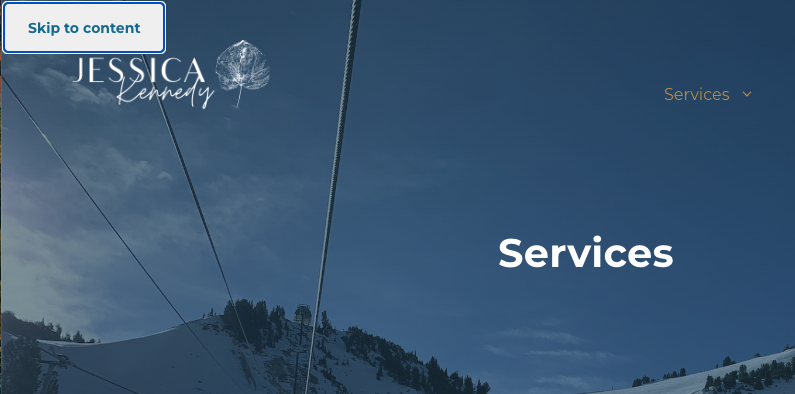
Ideally you’ll also have a Skip to Content link that appears in the upper left corner of your website so people can skip down to the content on each page instead of going through your full menu. These things may require a developer to implement, and they’re built in on some WordPress themes — like my go-to, GeneratePress.
Keyboard navigation sort of works on Squarespace 7.0 sites, but there’s no focus indicator. You can add one in with CSS. Squarespace 7.1 has a focus indicator built-in.
Use headings in the correct order.
Your website usually uses a set of heading tags from H1 to H4 or H6. These need to be used in the correct order. For example, in this post, my post title is tagged H1. Make sure you only have one H1 tagged element on each page.
The section headings in this post are H2, since they all fall under the overall H1 post title. Sometimes people using screen readers will just read the headings to skim to find the section they want to read fully, similar to how anyone else skims a page. Using headings properly benefits all of your website users, and it may benefit you in an SEO sense too.
I don’t use any H3 headings in this post, but if you had an H2 heading with several main points that fall under it, those should be H4, and so on down the line to H6. I rarely use H4, H5 or H6.
Where I see the most trouble with this is when people use heading tags to style text rather than show the information hierarchy. Avoid this and style text in other ways when possible.
Read more about proper heading order in this post from Amber Hinds on The Admin Bar’s website.
Use an automated tool to check for accessibility issues.
I’ve heard mixed reviews of automated accessibility scans, but I like the WAVE Web Accessibility Evaluation Tool. Not only does this tool show color contrast issues as listed above, it will also show you where you’re missing alt text on images, where you skip heading levels, etc. I run every website I audit through this tool as a first check.
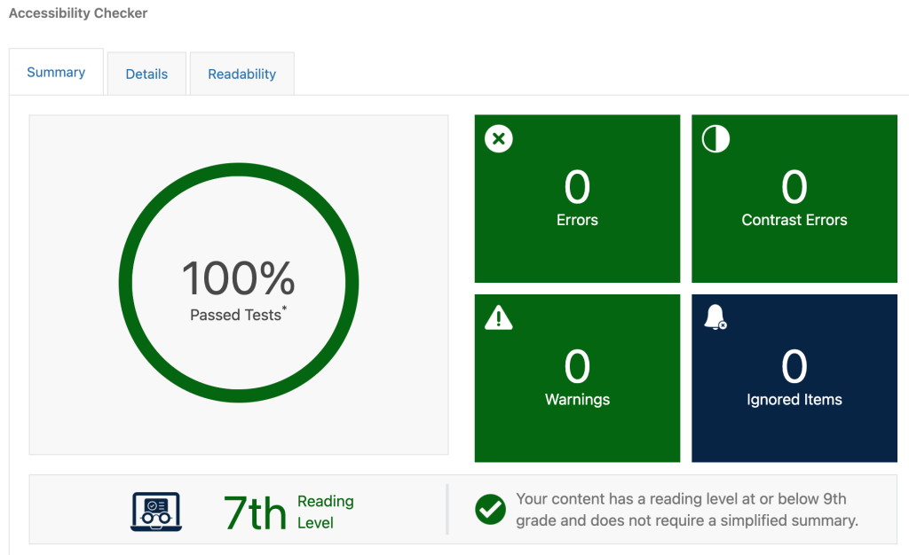
I also install the free Accessibility Checker plugin (pictured above) from Equalize Digital on most websites I manage. Once installed, this plugin lists any issues that are detectable by an automated scan on each page.
I’ll repeat — these automated tools don’t catch everything, but they’re a great first step.
Don’t use auto-playing content or anything that flashes.
If you have a background video on your website, add a play/pause button so people can choose whether it plays or not. I’m not sure who is still using blinking or flashing animations, but avoid these where possible.
This blog post goes into more detail about animations and accessibility, another gray area. The guidelines recommend avoiding unnecessary animation, so I recommend going through your website and thoughtfully considering any animation you have in use. Is it necessary? Does it make sense to use it?
Underline your links, and don’t underline text for emphasis.
Underlining, like using an incorrect heading style, is sometimes done for emphasis. Avoid this whenever possible to avoid confusion — instead, to emphasize text, add a background color, change the text color, change the sizing, etc. And when using links in your text, make sure they’re underlined. This helps all users know when something is clickable.
Warn users when a link will open in a new tab or window.
On WordPress there’s a super easy fix for this — the free Accessibility New Window Warnings plugin. It adds a little icon to any external links (links that open in a new tab or window). There’s no simple way to add this in Squarespace unfortunately.
Make sure your website is well-optimized for mobile and functions when zoomed in.
A fully mobile-responsive website is a must these days, and mobile optimization plays into accessibility since folks may be visiting your site from a variety of devices. Always check design or content changes you make on your website on a phone to make sure everything looks good and is working correctly. I often check on my iPhone, but you can use a tool like Responsinator to check many devices at once.
Another accessibility guideline is making sure your website still works when zoomed in to 200%. Zooming in on your website should increase the text size so it’s more readable, but it shouldn’t reduce functionality. Command and + on a Mac will zoom in your browser so you can make sure everything still looks good.
This is my home page zoomed in to 200%:
Take a look at your forms.
Forms are an important aspect of accessibility because they’re how someone takes action or gets in touch with you. If people (disabled or not) have trouble using your forms, that’s a real problem.
For forms, here’s what you should do/include:
- Only ask necessary questions — you can always follow up to ask more questions via email, a phone call, a meeting, etc. If you don’t need the info, don’t ask for it.
- Label fields with conventional terms (Name, Address, etc.) Clearly indicate how to enter this information (“enter dates in 11/11/11 format”), providing examples or hints when possible.
- List characters like $ or % next to the field so people don’t have to enter these characters on their own.
- Provide plenty of space in text boxes for people to type (and review) their answer.
- Make sure any required fields are clearly marked (usually with an * or “required” and usually in red).
- Make sure fields are clearly labeled when someone clicks into the input box — sometimes in-box labels disappear, and it’s easy to forget what the field is.
- Confirm successful form submission with a message or redirecting people to a new page.
- Clearly state errors next to the input field with the error, and provide help or info on how to correct the error.
- Warn users if they’ll need to provide external information (like a passport number).
- Avoid long drop-down menus for questions and instead let users type in their info.
Keep accessibility in mind anytime you make website changes.
Hopefully you have a bit better sense of accessibility challenges and solutions now. The ultimate goal of website accessibility is ensuring everyone can access what they need to online, which is a good thing to keep in mind.
When you make website changes, ask yourself if what you’re doing is necessary, if the changes will make your website more accessible, and if you’re confused or in doubt, reach out to a website designer who has experience with accessibility. I address accessibility occasionally in my monthly email newsletter if you’re interested in signing up.
Sometimes older websites are built on platforms that make accessibility updates really tough. In certain cases, it can be cheaper to redesign your website on a new platform than to fix the issues. And if your website has a lot of accessibility issues, it likely has a lot of general usability/user experience issues too. I love rebuilding or redesigning old websites, so reach out if you need any help.